


Introduction
In this guide, we are going to learn how to make your custom connect wallet button. Although, thirdweb provides an awesome connect wallet button which is super user-friendly and comes with a lot of functionalities, any frontend developer would like their own connect wallet which suits the UI and provides a customized user experience for their website.
What is thirdweb?
thirdweb is a complete development framework for web3 developers. It provides SDKs, CLI and a dashboard that streamlines the web3 app development such that a day 1 web3 developer can launch his first smart contract in few seconds.
Step-by-step guide
Create a Nextjs project from scratch
Install thirdweb dependencies
Setup the UI of our custom wallet button
make a custom wallet selector dialog box
integrate them with Wagmi functions provided by thirdweb
testing with thirdweb's native connect wallet
Code and Resources
Fork the Github repo: https://github.com/AnoyRC/custom-connect-thirdweb
The website is live at: https://custom-connect-wallet-delta.vercel.app/
Important Wagmi functions provided by thirdweb
What is Wagmi?
Wagmi is a collection of React hooks containing everything you need to start working with Ethereum. Wagmi makes it easy to "Connect Wallet", display ENS and balance information, sign messages, interact with contracts and much more. thirdweb uses Wagmi to manage wallet connections and interact with the smart contract.
useMetamask
It is a type of hook that prompts users to connect to their Metamask wallet.
Usage
import { useMetamask } from "@thirdweb-dev/react";

function App() {
  const connectWithMetamask = useMetamask();

  return (
    <button onClick={() => connectWithMetamask()}>Connect Metamask</button>
  );
}
useWalletConnect
It is a type of hook that prompts users to initiate a wallet connection through WalletConnect.
Usage
import { useWalletConnect } from "@thirdweb-dev/react";

function App() {
  const connectWithWalletConnect = useWalletConnect();

  return (
    <button onClick={() => connectWithWalletConnect()}>Connect wallet</button>
  );
}
useConnectionStatus
It is a type of hook that checks if the user is connected to our app. It has 4 states: connected, disconnected, connecting and unknown.
Usage
import { useConnectionStatus } from "@thirdweb-dev/react";

function App() {
  const connectionStatus = useConnectionStatus();

  if (connectionStatus === "unknown") return <p> Loading... </p>;
  if (connectionStatus === "connecting") return <p> Connecting... </p>;
  if (connectionStatus === "connected") return <p> You are connected </p>;
  if (connectionStatus === "disconnected")
    return <p> You are not connected to a wallet </p>;
}
useDisconnect
It is a type of hook that disconnects the current wallet connected with our app.
Usage
import { useDisconnect } from "@thirdweb-dev/react";

function App() {
  const disconnect = useDisconnect();

  return <button onClick={disconnect}>Disconnect</button>;
}
useAddress
It is a type of hook that returns the address of the currently connected wallet.
Usage
import { useAddress } from "@thirdweb-dev/react";

function App() {
  const address = useAddress();

  if (!address) return <div>No wallet connected</div>;

  return <div>My wallet address is {address}</div>;
}
useConnect (Optional)
It is a type of hook for connecting a supported wallet to your app. In this guide, we didn't use useConnect. To specifically import the wallet of our choice, we import the respective hooks of the wallet provider provided by thirdweb.
Usage
import { useConnect, metamaskWallet } from "@thirdweb-dev/react";

const metamask = metamaskWallet();

function App() {
  const connect = useConnect();

  return <button onClick={() => connect(metamask)}>Connect to MetaMask</button>;
}
Let's Start
Create an empty NextJS app
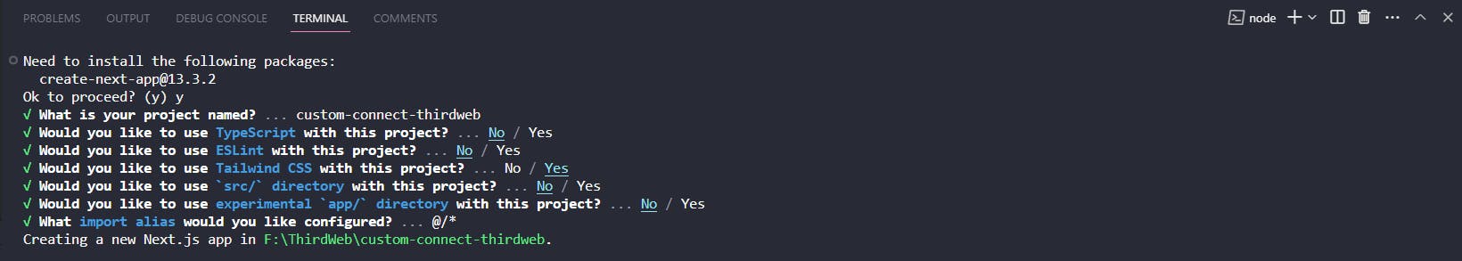
Create an empty NextJS app using the following command:
npx create-next-app@latest
My Configuration:
Install thirdweb Dependencies
Install thirdweb sdk for react using the following command:
npm i @thirdweb-dev/react @thirdweb-dev/sdk ethers@^5
Setup the UI of our custom wallet button
As we are building our custom wallet button, we should make our UI for that. For this guide, we are using TailwindCSS. But, you are free to use any styling framework or vanilla CSS.
import { Roboto } from "next/font/google";

const roboto = Roboto({
  weight: ["400", "700"],
  style: ["normal", "italic"],
  subsets: ["latin"],
});

export default function Home() {
  return (
    <div className="h-screen w-screen flex items-center justify-center">
      {/* Custom Connect Wallet Button */}
      <div
        className="transition ease-linear duration-300 rounded-3xl text-[#191919] p-4 px-5 border-[#06f2a8] bg-[#06f2a8] hover:cursor-pointer border-[1px] hover:shadow-[#06f2a8] hover:shadow-2xl"
      >
        <h1 className={`text-lg font-bold ${roboto.className} font-bold`}>
          Connect Wallet
        </h1>
      </div>
    </div>
  );
}
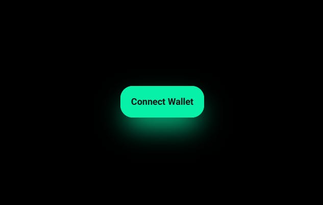
Boom !! Our button is looking awesome :)
Make a custom wallet selector dialog box
Let's make a components folder in the root and create a new file naming Dialog.js.
Let's import it first on our index.js file.
import { Roboto } from "next/font/google";
import Dialog from "@/components/dialog";

const roboto = Roboto({
  weight: ["400", "700"],
  style: ["normal", "italic"],
  subsets: ["latin"],
});

export default function Home() {
  return (
    <div className="h-screen w-screen flex items-center justify-center">
      {/* Custom Connect Wallet Button */}
      <div
        className="transition ease-linear duration-300 rounded-3xl text-[#191919] p-4 px-5 border-[#06f2a8] bg-[#06f2a8] hover:cursor-pointer border-[1px] hover:shadow-[#06f2a8] hover:shadow-2xl"
      >
        <h1 className={`text-lg font-bold ${roboto.className} font-bold`}>
          Connect Wallet
        </h1>
      </div>
    <Dialog />
    </div>
  );
}
Now, in Dialog.js file:
import { Roboto } from "next/font/google";
import Image from "next/image";

const roboto = Roboto({
  weight: ["400", "700"],
  style: ["normal", "italic"],
  subsets: ["latin"],
});

export default function Dialog(props) {

  // Wallet Menu, add more if you want, The UI will adjust automatically
  const menu = [
    {
      name: "Metamask",
      icon: "/metamask.svg",
    },
    {
      name: "WalletConnect",
      icon: "/walletconnect.svg",
    },
  ];

  return (
    <div className="fixed h-screen w-screen top-0 left-0 bg-slate-700/20 backdrop-blur-[10px] flex items-center justify-center">
      <div className="bg-[#222222] h-[350px] w-[500px] rounded-[40px] p-10">
        <div className="w-[100%] flex items-center justify-between">
          <h1
            className={`${roboto.className} font-semibold text-white text-2xl`}
          >
            Connect Wallet
          </h1>

          {/* Close Button */}
          <div
            className="h-10 w-10 bg-[#404040] rounded-2xl flex items-center justify-center hover:bg-[#3b3b3b] transition-colors duration-300 hover:cursor-pointer"
          >
            <Image src="/close.png" height={20} width={20} alt="Close" />
          </div>
        </div>
          <div className="w-[100%] flex flex-col h-[200px] mt-5">
            {menu.map((item, index) => (
              <div
                key={index}
                className="w-[100%] h-[50%] mt-5 rounded-xl bg-[#404040] flex p-5 items-center hover:bg-[#3b3b3b] transition-colors duration-300 hover:cursor-pointer"
              >
                <Image
                  src={item.icon}
                  height={20}
                  width={50}
                  alt="Icon"
                  className="object-cover"
                />
                <h1
                  className={`${roboto.className} font-semibold text-white text-xl ml-5`}
                >
                  {item.name}
                </h1>
              </div>
            ))}
          </div>
      </div>
    </div>
  );
}
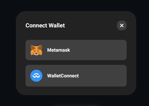
Awesome, we are done with the dialog box UI !! Let's start integrating, shall we?
Integrating with Wagmi functions provided by thirdweb
This section is the Cheese on toast. Before we start integrating, have you noticed? We can't close the dialog box, we made. Although, we have a close button, but it doesn't work.
Let's make a close button handler for that. In the index.js file:
import { Roboto } from "next/font/google";
import Dialog from "@/components/dialog";
import { useState } from "react";

const roboto = Roboto({
  weight: ["400", "700"],
  style: ["normal", "italic"],
  subsets: ["latin"],
});

export default function Home() {
  const [handleDialog, setHandleDialog] = useState(false);
  return (
    <div className="h-screen w-screen flex items-center justify-center">
      {/* Custom Connect Wallet Button */}
      <div
        className="transition ease-linear duration-300 rounded-3xl text-[#191919] p-4 px-5 border-[#06f2a8] bg-[#06f2a8] hover:cursor-pointer border-[1px] hover:shadow-[#06f2a8] hover:shadow-2xl"
      >
        <h1 className={`text-lg font-bold ${roboto.className} font-bold`}>
          Connect Wallet
        </h1>
      </div>
    {handleDialog && <Dialog dialogHandler={setHandleDialog} />}
    </div>
  );
}
In the Dialog.js, add the onClick function for the close button :
onClick={() => props.dialogHandler(false)}
Now, we can open and close the dialog box we created. We can use React-redux for achieving the same, but for a small project, using React's usestate is fine.
As we have discussed earlier, we will use useMetamask, useWalletConnect and useConnectionStatus to integrate our custom connect wallet button.
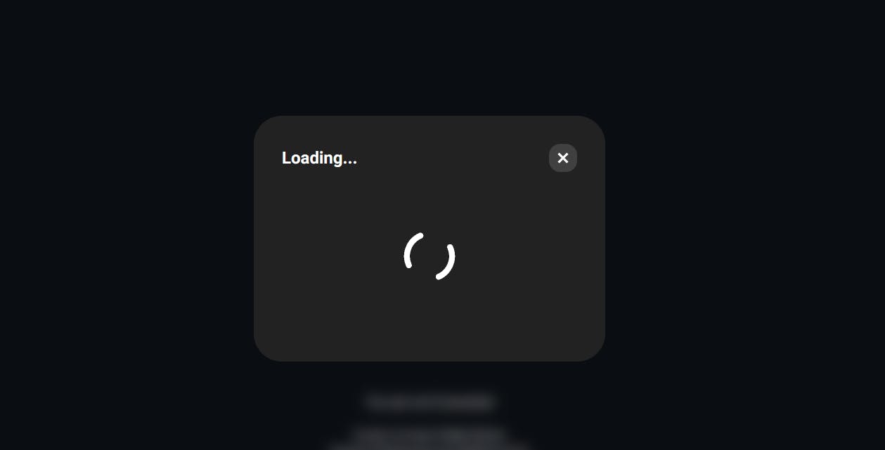
With optional rendering, we will use && operator to decide what to show, when we are connecting to our wallet, i.e. the "connecting" state.
Also, when are successfully connected to our wallet, we would close the popup automatically and show the disconnect button.
In Dialog.js :
import { Roboto } from "next/font/google";
import Image from "next/image";
import {
  useMetamask,
  useWalletConnect,
  useConnectionStatus,
} from "@thirdweb-dev/react";
import { useEffect } from "react";
import loading from "../public/Loading.gif";

const roboto = Roboto({
  weight: ["400", "700"],
  style: ["normal", "italic"],
  subsets: ["latin"],
});

export default function Dialog(props) {
  const metamask = useMetamask();
  const walletConnect = useWalletConnect();
  const connectionStatus = useConnectionStatus();

  // Wallet Menu, add more if you want, The UI will adjust automatically
  const menu = [
    {
      name: "Metamask",
      icon: "/metamask.svg",
      onClick: metamask,
    },
    {
      name: "WalletConnect",
      icon: "/walletconnect.svg",
      onClick: walletConnect,
    },
  ];

  // Close Dialog when connected
  useEffect(() => {
    if (connectionStatus === "connected") {
      props.dialogHandler(false);
    }
  }, [connectionStatus]);

  return (
    <div className="fixed h-screen w-screen top-0 left-0 bg-slate-700/20 backdrop-blur-[10px] flex items-center justify-center">
      <div className="bg-[#222222] h-[350px] w-[500px] rounded-[40px] p-10">
        <div className="w-[100%] flex items-center justify-between">
          <h1
            className={`${roboto.className} font-semibold text-white text-2xl`}
          >
            {connectionStatus === "connecting"
              ? "Loading..."
              : "Connect Wallet"}
          </h1>

          {/* Close Button */}
          <div
            className="h-10 w-10 bg-[#404040] rounded-2xl flex items-center justify-center hover:bg-[#3b3b3b] transition-colors duration-300 hover:cursor-pointer"
            onClick={() => props.dialogHandler(false)}
          >
            <Image src="/close.png" height={20} width={20} alt="Close" />
          </div>
        </div>

        {/* Check Loading or show Wallet Menu */}
        {connectionStatus === "connecting" ? (
          <div className="w-[100%] flex flex-col h-[200px] items-center justify-center mt-5">
            <Image src={loading} height={100} width={100} alt="Loading" />
          </div>
        ) : (
          <div className="w-[100%] flex flex-col h-[200px] mt-5">
            {menu.map((item, index) => (
              <div
                key={index}
                className="w-[100%] h-[50%] mt-5 rounded-xl bg-[#404040] flex p-5 items-center hover:bg-[#3b3b3b] transition-colors duration-300 hover:cursor-pointer"
                onClick={item.onClick}
              >
                <Image
                  src={item.icon}
                  height={20}
                  width={50}
                  alt="Icon"
                  className="object-cover"
                />
                <h1
                  className={`${roboto.className} font-semibold text-white text-xl ml-5`}
                >
                  {item.name}
                </h1>
              </div>
            ))}
          </div>
        )}
      </div>
    </div>
  );
}
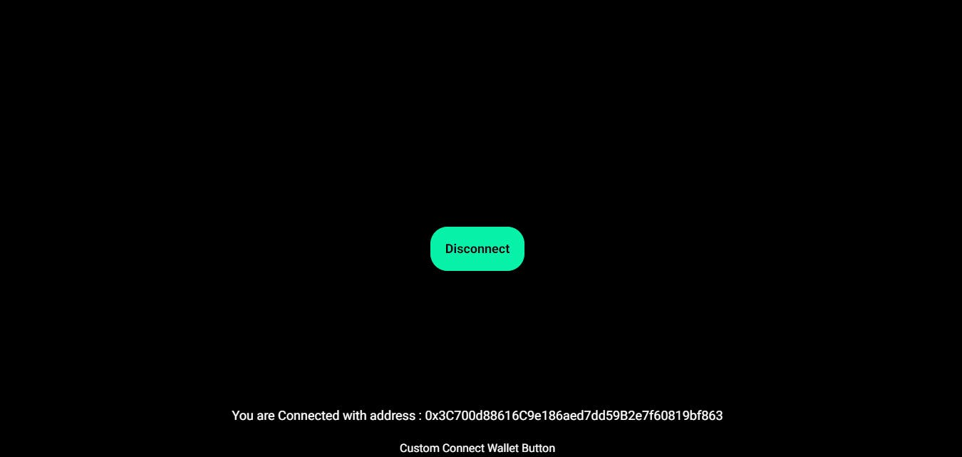
If we are connected to the wallet, we would just change the connect button to the disconnect button. And show the connected address on the screen.
In index.js :
import Dialog from "@/components/dialog";
import {
  ConnectWallet,
  useAddress,
  useConnectionStatus,
  useDisconnect,
} from "@thirdweb-dev/react";
import { Roboto } from "next/font/google";
import { useState } from "react";

const roboto = Roboto({
  weight: ["400", "700"],
  style: ["normal", "italic"],
  subsets: ["latin"],
});

export default function Home() {
  const [handleDialog, setHandleDialog] = useState(false);
  const connectionStatus = useConnectionStatus();
  const address = useAddress();
  const disconnect = useDisconnect();

  const handleConnect = () => {
    if (connectionStatus === "connected") {
      disconnect();
    } else {
      setHandleDialog(true);
    }
  };

  return (
    <div className="h-screen w-screen flex items-center justify-center">
      {/* Custom Connect Wallet Button */}
      <div
        className="transition ease-linear duration-300 rounded-3xl text-[#191919] p-4 px-5 border-[#06f2a8] bg-[#06f2a8] hover:cursor-pointer border-[1px] hover:shadow-[#06f2a8] hover:shadow-2xl"
        onClick={handleConnect}
      >
        <h1 className={`text-lg font-bold ${roboto.className} font-bold`}>
          {connectionStatus === "connected" ? "Disconnect" : "Connect Wallet"}
        </h1>
      </div>

      {/* Connection Status */}
      <div className="fixed h-screen w-screen flex flex-col justify-end items-center -z-10">
        <h1 className={`text-lg ${roboto.className} text-white mb-5`}>
          {connectionStatus === "connected"
            ? `You are Connected with address : ${address}`
            : "You are not Connected"}
        </h1>
      </div>

      {/* Wallet Selector Dialog Box */}
      {handleDialog && <Dialog dialogHandler={setHandleDialog} />}
    </div>
  );
}
VOILA!! We have created our own connect wallet button.
Testing with thirdweb's native connect wallet
Let's add thirdweb's connect wallet button and check if it's working fine.
In index.js, let's import connect wallet and see if it is syncing with our connect wallet button:
import Dialog from "@/components/dialog";
import {
  ConnectWallet,
  useAddress,
  useConnectionStatus,
  useDisconnect,
} from "@thirdweb-dev/react";
import { Roboto } from "next/font/google";
import { useState } from "react";

const roboto = Roboto({
  weight: ["400", "700"],
  style: ["normal", "italic"],
  subsets: ["latin"],
});

export default function Home() {
  const [handleDialog, setHandleDialog] = useState(false);
  const connectionStatus = useConnectionStatus();
  const address = useAddress();
  const disconnect = useDisconnect();

  const handleConnect = () => {
    if (connectionStatus === "connected") {
      disconnect();
    } else {
      setHandleDialog(true);
    }
  };

  return (
    <div className="h-screen w-screen flex items-center justify-center">
      {/* Custom Connect Wallet Button */}
      <div
        className="transition ease-linear duration-300 rounded-3xl text-[#191919] p-4 px-5 border-[#06f2a8] bg-[#06f2a8] hover:cursor-pointer border-[1px] hover:shadow-[#06f2a8] hover:shadow-2xl"
        onClick={handleConnect}
      >
        <h1 className={`text-lg font-bold ${roboto.className} font-bold`}>
          {connectionStatus === "connected" ? "Disconnect" : "Connect Wallet"}
        </h1>
      </div>

      {/* Connection Status */}
      <div className="fixed h-screen w-screen flex flex-col justify-end items-center -z-10">
        <h1 className={`text-lg ${roboto.className} text-white mb-5`}>
          {connectionStatus === "connected"
            ? `You are Connected with address : ${address}`
            : "You are not Connected"}
        </h1>
        <h1
          className={`text-base ${roboto.className} text-white mb-5 text-center`}
        >
          Custom Connect Wallet Button
          <br />
          Supports Metamask and WalletConnect
          <br /> Can you add more?
        </h1>

        {/* thirdweb Connect Wallet Button (Non Clickable) */}
        <div className=" mb-5 ">
          <ConnectWallet />
        </div>
        <h1
          className={`text-base ${roboto.className} text-white mb-5 text-center`}
        >
          {"thirdweb Connect Wallet Button (Non Clickable)"}
        </h1>
      </div>

      {/* Wallet Selector Dialog Box */}
      {handleDialog && <Dialog dialogHandler={setHandleDialog} />}
    </div>
  );
}
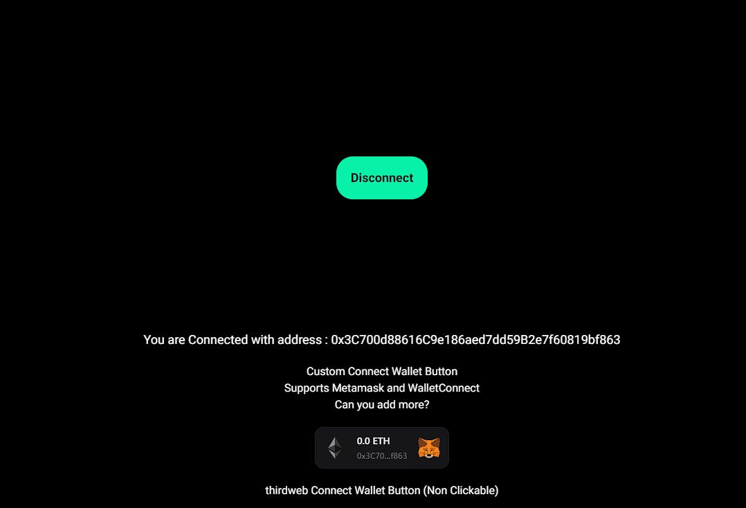
Look at that!! Our button is syncing with thirdweb's connect button.
Hope you like the blog!! Leave a like if you made it this far :)